How to earn $5000/month by designing great logos?
Logo designing is a skill. Earn $5000 extra by learning this skill. Read it, master that.
How do you remember a brand? By their name, logo or colours in that logo. Every brand holds their unique logo.

Most startups are going to shut down in the era of entrepreneurship. It is a well-established fact. So, there is a great demand for logo designers. Moreover, a lot of competitions are conducted around the globe annually with great prizes.
You can earn up to $5,000/month full-time and up to $2,000/month in part-time.
So, let's get down to logo designing. Logo designing is an art and the art can’t be taught to anybody. This can only be refined with practice. But some common things are a must for any logo design artist. You can also do this as a freelancer. No need to do it full-time.
GOOD LOGO?
A logo is the identity of a company. The logo should be memorable to your audience or your client to get selected. Moreover, a logo should be very smooth and scalable. For example, a logo can be presented on a website, by e-mail or it can be printed on big banners, t-shirts, walls and big statues. So, make sure that your logo looks great when used either way.
There is a book that you must be familiar with- “Steal Like an Artist” by Austin Kleon. This boom tells about taking inspiration. You may think that you will make your logo that your mind will tell you. I am warning you, that this will just destroy your work. The more unique you would like to be the worse you are going to make it. There is nothing original there in design. I am not suggesting copying anything. Even for this, you may be sued and may have to face serious problems.
Look at the other people’s logos and illustrations. They may provide you with some great ideas about your design. You can take inspiration from colours, types of designs, fonts, and specific designs or colours common to your industry.
Summary:
1. Read 'Steal Like an Artist'
2. Gather all the logos of your interest
3. Avoid being 100% original
RESEARCH THE COMPETITION
Design is prepared mentally first. It is then engraved on the canvas. Researching the competition is a must for great designs. You may consider but are not limited to:
- Age: Age range of the audience and their choices. Modern or classic will be determined according to the people to which the design is oriented.
- Colours: They may evoke feelings in the audience. It’s your responsibility that the colour chosen is right according to the client. The colours may have different meanings in different cultures. So, understand the audience well before designing the logo.
- History: If you can find any such evidence that you think you must be aware of then, you should look at the history also. This will provide you insight into what will work and what will not work.
- Competition: Look at some specific patterns in design that the brands in your industry follows. They may be colours, fonts, shapes, names, strokes, etc.
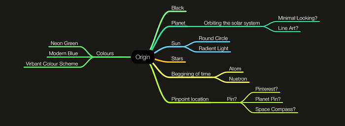
You can use the applications like MindNode➚ to generate ideas. I would suggest writing the words that strike your mind. Then I would suggest writing more words related to your previous directly linked words. This will generate a great number of ideas for your logo. One Hour is sufficient for this funning and important part.


You can use pen and paper also. The figure indicates colours, shapes, different ideas etc.
You may gather ideas, pictures etc. from different websites. Then place them at the same place. You can use the applications like Milanote➚ for gathering ideas.
Summary:
1. Build a word map of ideas
2. Research the competitors
3. Create mood and colour brand
GENERATE IDEAS
- Design Initial Ideas- Take a pen and paper or on an iPad using Apple Pencil. Then draw whatever strikes your mind related to the words map. You may take inspiration from the logos you collected.
- Consider Brief Goal- In the designing process, remaining on the right track is a great challenge. You need to look at the direction in which you were moving. So, make sure that you are making anything but related to your goals.
- Refine Your Concepts- Being distracted from your goal is very easy. So, refining them timely is a great challenge. The simple thing that you may consider is looking back at your concept map.
REFINE YOUR SKETCH
Up to this point, we haven’t used the technology for making the logo. Here we are going to do four things:-
- Choose the logo that best suited our needs. You can look at scalable and simple logos rather than complex ones.
- Sketch a high-resolution version on an iPad or Tablet.
- A simple thing then you have to do is adjust and refine the details. It’s necessary because in the next step we are going to use this sketch to make our perfect logo.
- Export image as .jpg.
Adobe Illustrator Use
- Now use that exported .jpg in the background. Bringing the design to Adobe Illustrator is very important.
- Now, just duplicate that .jpg and build the logo. You must be familiar that this time you will work with vectors. So, make the same logo in Illustrator.
- I would suggest making the logo in a non-destructive format. Copy and paste again every time after you have finished designing a part. This is because of a simple fact. We as designers are very curious about different combinations. Moreover, we hate repetitions. So, make sure to work with copy and paste, again and again. This will provide you with better design options.
- The final step would be refining the details. This may include small details like more smooth corners, colour gradient, different shades etc. A great change in the design at this point would just destroy the design. Make sure that you remain on the tract.
TYPOGRAPHY
- Select Typeface Options: You can use Sans-Serif for the modern look and Serif for old looks. So, I would suggest using Sans-Serif fonts. It will provide a clean look.
- Choose Typeface and Icon Style: After collecting all the different typeface options select the best one.
- Match icon and type proportions: Consistency is a key part of the design. Make sure the typography used by you should have a similar weight as that of your logo.
- Adjust Kerning: Sometimes the letter spacing in the default typography isn’t up to the mark. In that case, you have to adjust the spacing by yourself.
- Iterate until visual pleasing: Remember, nobody will look at your hard work. Everyone will look at the final result. It’s similar to the concept of life. So, go for any adjustment you think would make a difference. I would suggest doing it in a non-destructive fashion would be better. Redo and Undo will make the work cumbersome.
COLORS
Now, it’s time to add colours to our logo. It’s very crucial to add the correct colour according to the target audience, and the specific mood that you want the audience should have while looking at the brand logo.
- Choose Color Palette: The first step would be choosing between different colours. You can search on the web, various design blogs like this one from Canva. You can take inspiration about colour from web pictures, other logos and animations. Every image can be used by you for inspiration purposes. Only commercial use is illegal.
- Input into colour picker: If you are taking colour inspiration from any blog or website, they will provide you with the hex codes of the colours. But in the case you are taking inspiration from the images, getting hex codes from the colour picker would be a great option. I would suggest using a hex code system for colour picking.
- Experiment with gradient: After selecting the base colour, you can try different shades of the same colour. You can use Figma plugins for faster workflow. Here are some best plugins-
You can use multiple colours in your logo. The problem will come when you will use random colours. But please don’t use more than 3–4 colours.
USE MULTIPLE MOCKUPS
You must try your logo with different mockups. It’s because the logo has to be displayed on various types of fires, maybe on clothes, maybe in an application, on a website for sure etc. So, try these three things-
- Find the Mockups specific for the client
- Add logos as a smart layer: You have to use Adobe Photoshop rather than illustrator for this purpose. It’s because Mockups aren’t vectors.
- Adjust the Design according to the needs.
Present the logo to the client along with all the work you have done. Showing your hard work will increase the trust of your employer in you.The ground doesn’t matter if you are a good player in your field.
Did you find this article useful? If yes, do you have a dollar by chance? I would be very thankful to you.
For Crypto Lovers-
₿: 0x0c08c5DcC92905c090b3EBfFD0c5540b0aC2c12f
